

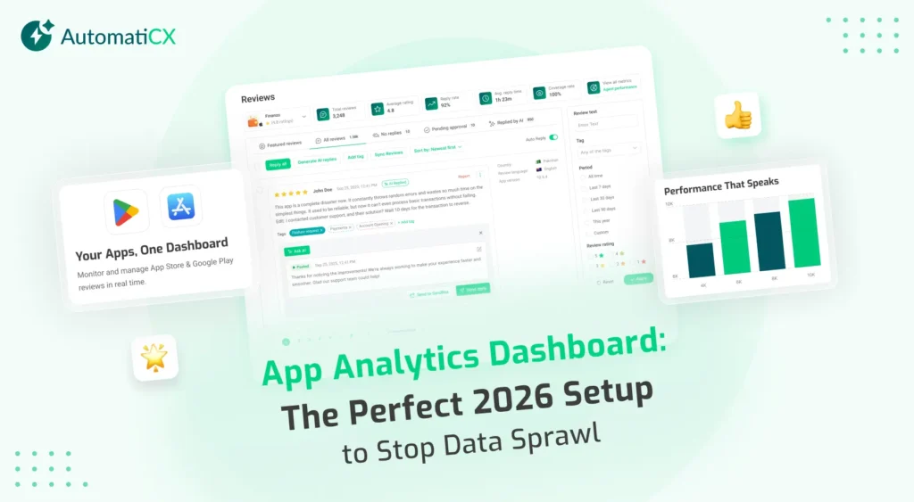
Having too much data is just as dangerous as having no data at all. If your setup contains fifty different charts, your team will suffer from analysis paralysis. A modern app analytics dashboard must be ruthless about visibility. It must separate human behavioral metrics from machine performance metrics to provide instant, actionable clarity.
If you want to scale a product today, you cannot afford operational blindness. Your app analytics dashboard must focus on active engagement and technical stability, rather than drowning your team in vanity metrics.
The perfect app analytics dashboard eliminates data sprawl by strictly separating marketing metrics (DAU/MAU, LTV, day-30 retention) from engineering vitals (crash rates, ANRs, cold start times). In 2026, a highly effective app analytics dashboard relies on cohort-based tracking to respect privacy laws while consolidating all operational insights into a single, unified source of truth.
The Danger of Sprawl in Your App Analytics Dashboard
Data abundance often creates operational blindness. When product teams connect their software to a new tracking provider, the default behavior is to log every single event possible. This creates massive sprawl across your app analytics dashboard. Teams end up adding charts and graphs simply because the data is available, rather than because the data drives an actual business decision.
When an app analytics dashboard becomes a dumping ground for data, teams simply stop looking at it. Furthermore, sprawling dashboards usually rely heavily on vanity metrics. Vanity metrics look impressive in a slide deck but offer zero predictive value for actual business outcomes.
You must remove metrics like Total Cumulative Installs or Raw Registered Users from your daily app analytics dashboard immediately. Knowing you have one million lifetime downloads does not tell you if those users actually open the software today.
The Marketing View
A successful reporting structure explicitly separates the marketing view from the engineering view. The growth team requires a dedicated section within the app analytics dashboard that focuses entirely on acquisition, user engagement, and lifetime value.
To track human behavior effectively, your marketing view must highlight:
The Stickiness Ratio (DAU/MAU)
Your true north star. You calculate this by dividing your Daily Active Users by your Monthly Active Users. (We discuss the specific mathematics behind this deeply in our Mobile App Analytics Guide).
Cohort Retention
Aggregate data hides drop-offs. The marketing dashboard must track cohort retention, specifically isolating day-one, day-seven, and day-thirty retention rates against broad industry benchmarks like those tracked by Statista.
The LTV: CAC Ratio
This metric compares the Lifetime Value of a user against your Customer Acquisition Cost. If you manage a travel booking application, your marketing dashboard should strictly prioritize the funnel conversion rate from the initial “Flight Search” event to the final “Completed Checkout” event.
The Engineering View: Technical Vitals and Stability
Your marketing metrics do not matter if the underlying software is broken. The engineering team requires a completely separate view within the app analytics dashboard dedicated to technical stability. Mixing technical error reports with marketing conversion charts creates unnecessary confusion for both departments.
To track machine reliability effectively, your engineering view must monitor:
Crash-Free User Rate
This metric must be maintained above 99.5 percent at all times, matching the baseline standard set by platforms like Firebase Crashlytics. You should read our complete breakdown on App Crash Rates to understand exactly how search algorithms penalize software that falls below this threshold.
Cold Start Times
This measures exactly how many seconds it takes from a screen tap to full interactivity. In 2026, users will not wait longer than two seconds.
ANR Rate (Application Not Responding)
Your app analytics dashboard must track exactly how often the interface freezes and forces the user to wait, as this silently destroys early retention.
Marketing vs. Engineering
To prevent operational bottlenecks, format your app analytics dashboard to respect the distinct goals of each department.
Dashboard View | Primary User | Core Objective | Top 3 Required Metrics |
The Marketing View | Growth Leads & Product Managers | Maximize engagement, retention, and revenue. | Stickiness Ratio (DAU/MAU), Day-30 Cohort Retention, LTV: CAC Ratio |
The Engineering View | Lead Developers & QA Teams | Ensure technical stability and minimize latency. | Crash-Free Session Rate, Cold Start Time, ANR Rate |
Navigating 2026 Privacy Frameworks
The era of granular, individual user tracking is permanently over. The evolution of mobile privacy laws and strict frameworks like Apple’s App Tracking Transparency (ATT) have fundamentally changed how an app analytics dashboard processes information. You can no longer rely on deterministic tracking to follow a single user across every action they take on their device.
Modern app analytics dashboards must rely on aggregated, cohort-based data. Instead of tracking a specific user identity, your app analytics dashboard must track anonymized groups of users who share similar behaviors or acquisition sources. Your tracking architecture must respect modern privacy constraints while still delivering highly accurate business intelligence.
Centralizing Your App Analytics Dashboard Strategy
Building these distinct, role-specific views manually requires massive engineering resources. You must extract data from a crash reporting tool, pull engagement data from a marketing platform, and pipe everything into a third-party visualization software. This manual infrastructure is expensive to maintain and breaks frequently.
You need a centralized system that does the heavy lifting for you. We strongly recommend using a professional platform to consolidate your app analytics dashboard.
AutomatiCX offers a specialized and customizable view that gives real insights into the marketing data to make decisions. You can remove the dashboard sprawl, separate your core metrics and gain the exact insights required to scale up your products and services.
Frequently Asked Questions
What is the difference between a product and marketing app analytics dashboard?
A product dashboard brings real-time insights like app behavior, paying attention to metrics like crash rates and load times. On the other hand, a marketing dashboard focuses on acquisition, tracking cost per install and conversion rates as well.
How many metrics should be on an app analytics dashboard?
Best practices dictate keeping your primary daily app analytics dashboard limited to the core eight to twelve metrics that directly impact your business goals. Tracking more often leads to analysis paralysis.
What are vanity metrics in an app analytics dashboard?
Vanity metrics look good on paper but they do not provide real-time insights for overall business health. There are so many examples out there such as cumulative downloads or raw page views. It is recommended that these should be replaced with outcome-based data like day-thirty retention as well.